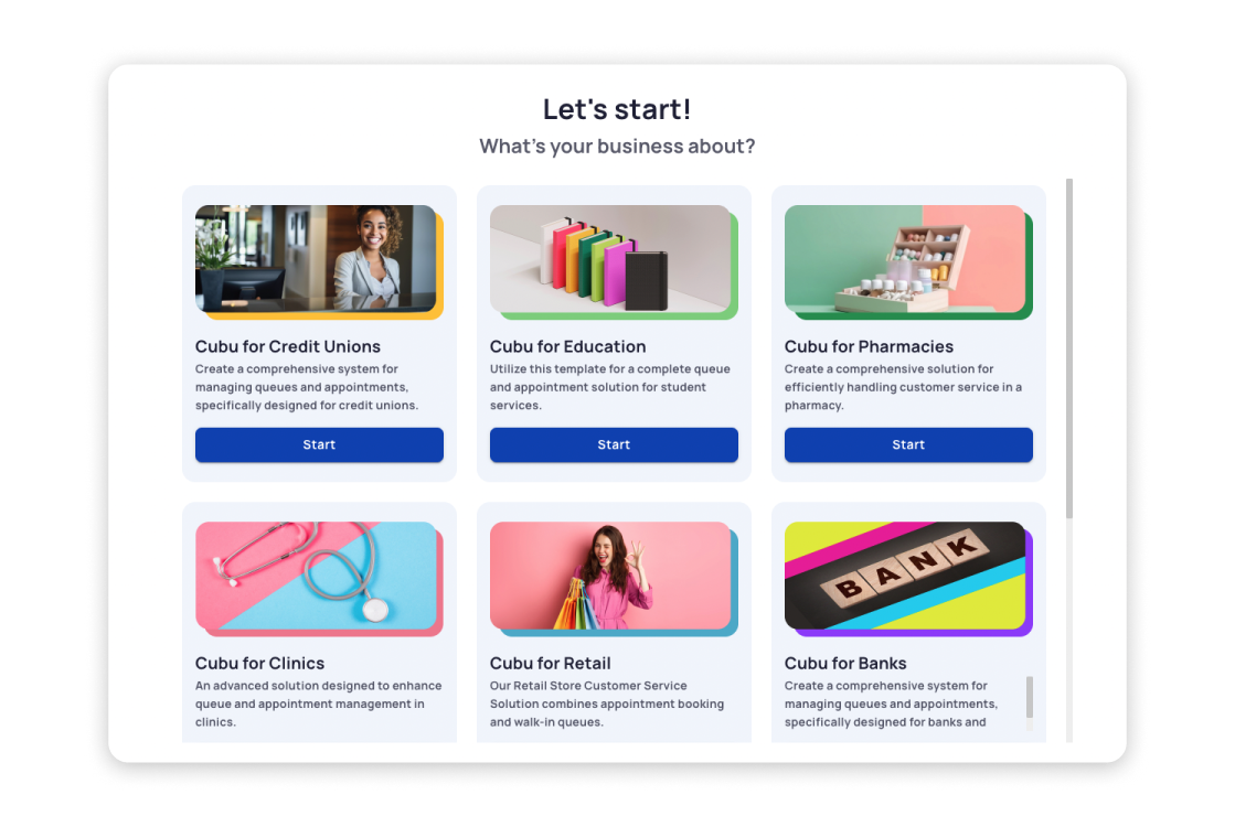
Cubu: multifunctional SaaS CRM platform
Position: Product Designer
Tasks: user flows, UX design, UI design, delegating tasks, managing component library
Tools used: Figma
About the project
For the past two years, I have been a part of a company (~80 employees) working on a product called Cubu. It’s an integrated system for managing business-customer interactions, such as client case management, booking and queue management for organizations of any size (from small shops to clinic chains), communicating via different channels (email, SMS) etc.
My main role was designing complete ready-for-development user interface layouts for various product parts such as onboarding, features for agents, managers, system administrators, an online portal for booking appointments, digital signage screens (wall TV) , and even a paper ticket builder.
First, I’d like to share some use cases that were typical for my day-to-day tasks. After that, I will show examples of features that I’ve successfully delivered.
Booking button
Problem description
One of the tasks I worked on was optimizing the transition of the calendar into booking mode. The issue was that in any specialist’s calendar, even if they offer just one service, there are likely to be multiple versions of this service (Service Type) for meetings of different durations. For this reason, it’s necessary to display slots according to their duration. The previous solution involved a toggle switch activating a two-level dropdown for sequential selection of the service and the type of meeting. The main problem here was the position of the dropdown, which was almost flush with the right side of the screen, causing the second level to open to the left, contrary to the direction indicated by the arrow and the general reading direction. According to the testing team reports, this solution was not only ergonomically inefficient (requiring moving the cursor to the other side of the screen) but also made use particularly cumbersome if the service name was long.

Suggestion one – changing UI element
The first thing I suggested was to eliminate the unnecessary click of the toggle switch by replacing it with a button:

Suggestion two – re-thinking dropdown
Upon pressing, the button immediately switches the calendar to booking mode, and it itself transforms into a dropdown, but not a two-level one, rather a single-level:

In the single-level dropdown, the service names are provided as headers for groups of Service Types associated with that service. This eliminates the issue with the awkwardly expanding second dropdown. When the desired duration and meeting channel are selected, the slots in the calendar change accordingly. Exiting booking mode is possible by clicking on a close button nearby. Here you can see how all of this works:
")
Outcome
The provided solution made the layout more stable on different screens and the behavior of the element more smooth. Also, according to the feedback of QA, the process of choosing the right Service Type/Service became much more handy.
Shifts schedule widget
Problem description
Another task of mine was to redesign the shift schedule widget from the agent’s dashboard. This widget is the main feature on the agent dashboard. Its purpose is to display the schedule of shifts for the upcoming days with a breakdown by units, as well as some statistical data about completed shifts.
Early users and QA team reported several inconveniences of the widget: it showed only three upcoming days, space was used inefficiently, there was no indication for shifts in different time zones, and to view the attendance statistics of a completed shift, it was necessary to expand an accordion.
Understanding requirements
Given the above, the following requirements were summed up for the new widget:
— Include more days
— Propose another solution for showing different units
— Add indication for a different time zone
— Propose a solution for showing booking/no show stats without expanding accordions
Below is the old widget.
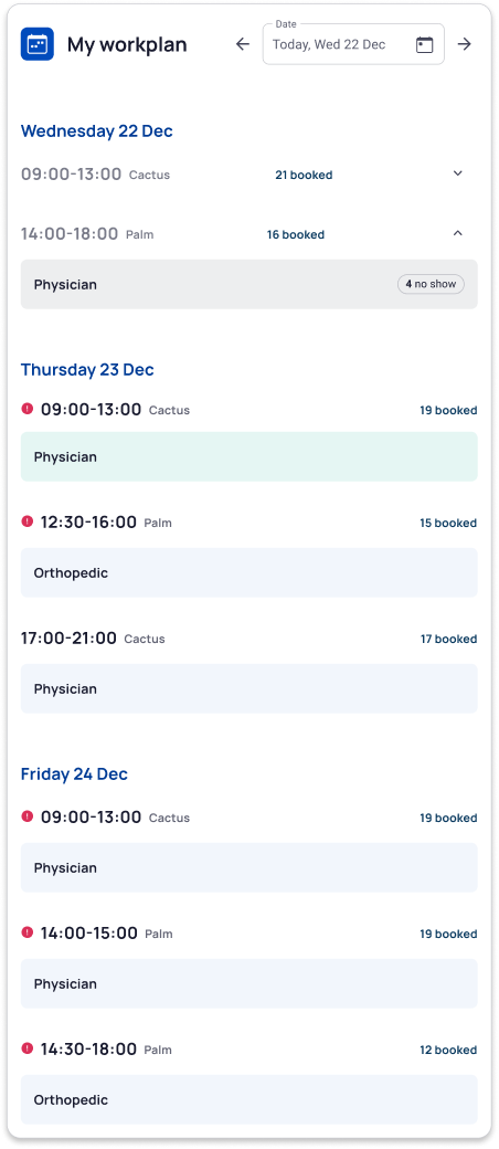
Suggested changes
After reviewing the requirements, I came up with the following solution:
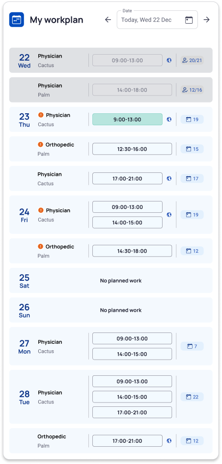
— Shifts of the same service for each unit are shown in separate containers with the date only in the top one, which visually is better than having the date as a headline above and unifies visually containers related to the same date.
— Schedule is displayed for a week ahead (the above-described grouping of shifts allows increased density of displayed information).
— Unit name is shown inside the container.
— There are no accordions for completed shifts — instead, the attended/booked statistics is displayed directly in the container.
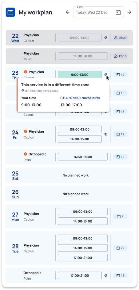
— There is an indication for a different time zone directly next to the shift time.
The new widget is shown below.
And here is how a popover for the different time zone looks like:
Outcome: good feedback from beta users
As a result of the described implementation, we received good feedbacks from our beta users.
Embedded portal
Discussing new concept
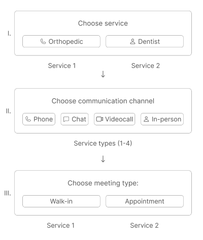
At some point during my work on Cubu, I was tasked with designing an embeddable portal for the client’s website. The feature’s objective was to enable the fastest possible meeting arrangement with a specialist — either an immediate one (“Walk-In”) or by booking an appointment (“Appointment”). According to the feature’s concept, which was motivated in part by marketing interests, after selecting a service — for example, «Consulting» or «Sales Department» — the next step should immediately be the choice of communication channel. Following this, the visitor decides whether to have the appointment now or to schedule for later:
Unable to implement the concept
During the design process, we found out that the internal logic of the portal (which by that time already existed as a separate web service) did not allow the implementation of the desired selection sequence. The issue was that services and communication channels were organized according to the following hierarchy:
Service category > Service type > Service
The purpose of the Service Category is as follows:
b) to determine different meeting formats — Service Types («Short — 10 minutes,» «Long — 15 minutes,» etc.), including communication channels.
Each service has access to all Service Types within its Service Category. However, a single service can belong to only one Service Category. Finally, the service itself can either be walk-in or by appointment. This means that for the same service, to allow both immediate and booked meetings, it is necessary to create two different services in the system (For example, «Immediate Sales Department Consultation» and «Scheduled Sales Department Consultation»).
According to the existing logic of the portal, the user must first select a Service Category, then a Service Type, and finally the specific service itself. The desired sequence of selection in the embedded portal does not meet the feature concept because the service cannot be chosen before selecting the Service Type. Moreover, since Walk-In/Appointment are parameters of the service itself, the selection cannot be divided into two stages.
Thus, the internal logic of the system suggests the following scheme:
Suggested changes are going to kill the concept
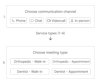
Clearly, such a structure not only fails to meet the initial concept, where the communication channel is selected following the service, but it also constitutes poor UX: users are forced to understand that for each service, there are two buttons depending on the type of meeting (Walk-In/Appointment). This setup already looks inconvenient when there are only two services, but if there are 3 or 4 services, users would have to choose from 6 or 8 buttons, all displayed at once.
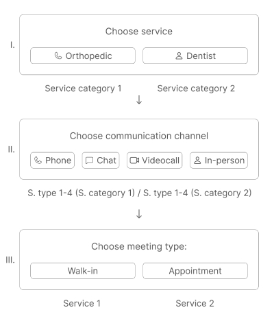
A creative solution found
When the option of abandoning the feature concept was already being discussed, I proposed trying an unexpected move – to be more flexible and use the system’s structure in an unconventional way. As mentioned earlier, the service selection cannot be divided into 2 stages (I and III, see image 1), since the type of appointment (walk-in or booked) is a parameter of the service itself. However, we can use the Service Category to mimic this division. The resulting scheme is as follows: we create 2 Service Categories – in order to allow two types of meetings for one service (e.g., “Sales Walk-In” and “Sales by Appointment”). Each Service Category should contain 4 Service Types for each communication channel. Thus, after choosing a Service Category, the user selects the desired communication channel (represented by Service Types), and finally, the type of meeting using the Walk-In and Appointment buttons, which technically are two different services under one Service Category:
Summary: the concept saved, the feature released
So, by leveraging an unconventional use of the system’s internal logic and without compromising the functionality in any way, I managed to retain this feature and facilitate its release.
Selected layouts
In this section, I’d like to show some of interesting layouts that I designed with a short description.
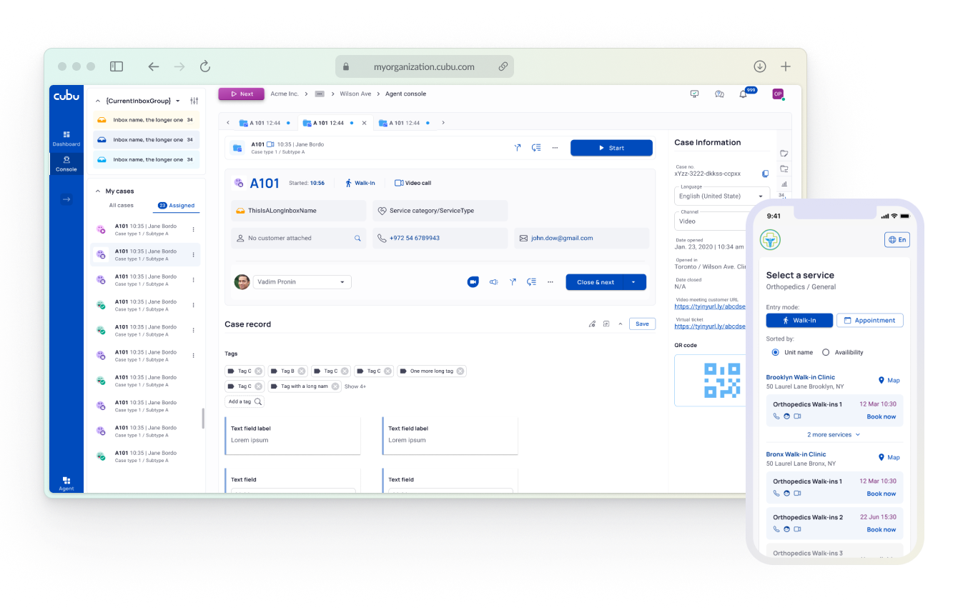
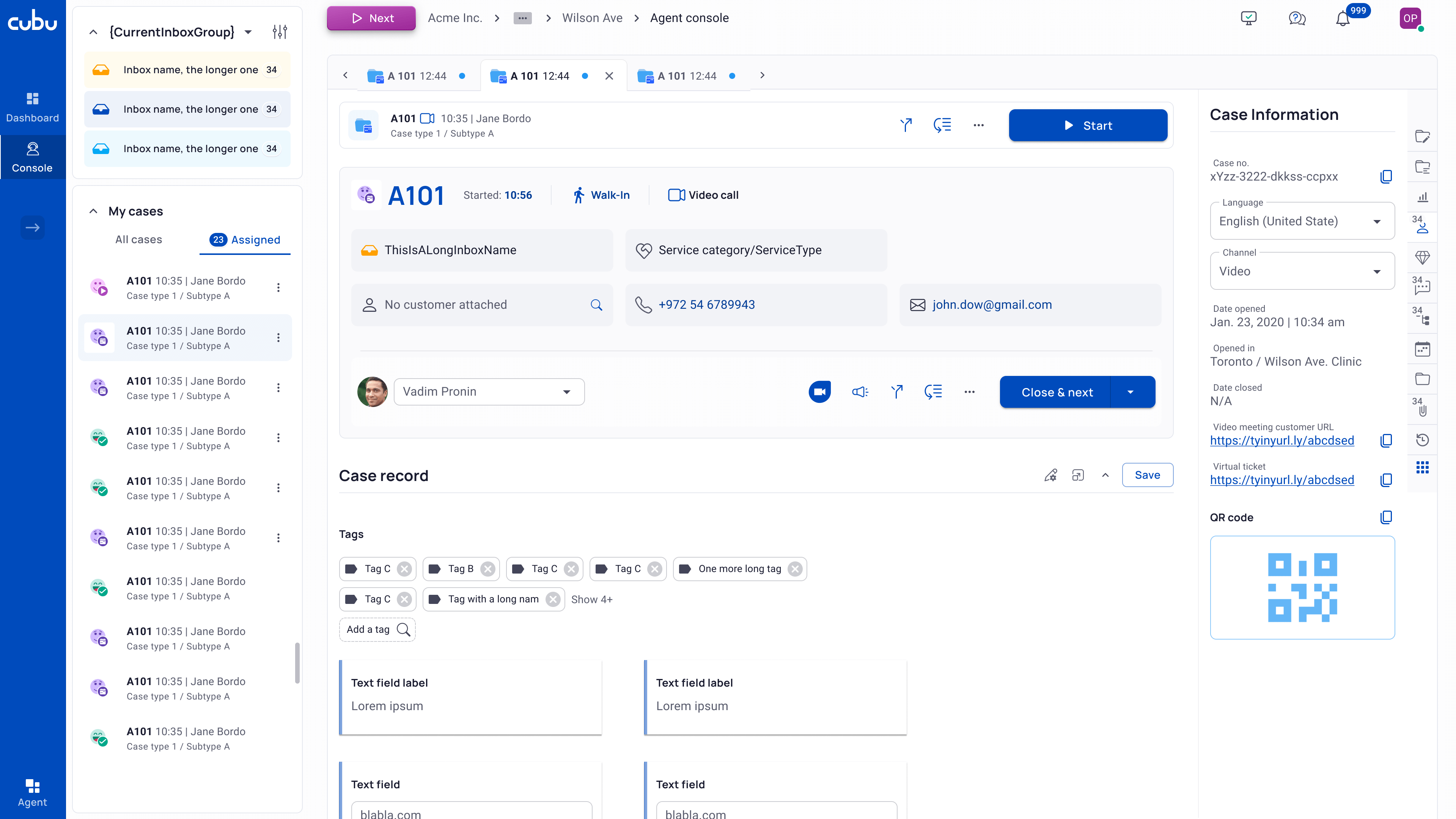
Case Tab
Case Tab is the main screen used by agents. On the left, there is a list of inboxes and cases associated with the agent. The central part displays essential information about the case, its content and tools for working with it. On the right, there’s a tab bar with various tabs that are customized according to the organization’s needs.
Since the speed of processing is a critical metric in almost any organization, the visual layout of the case space must be logically structured and have a clear visual hierarchy.
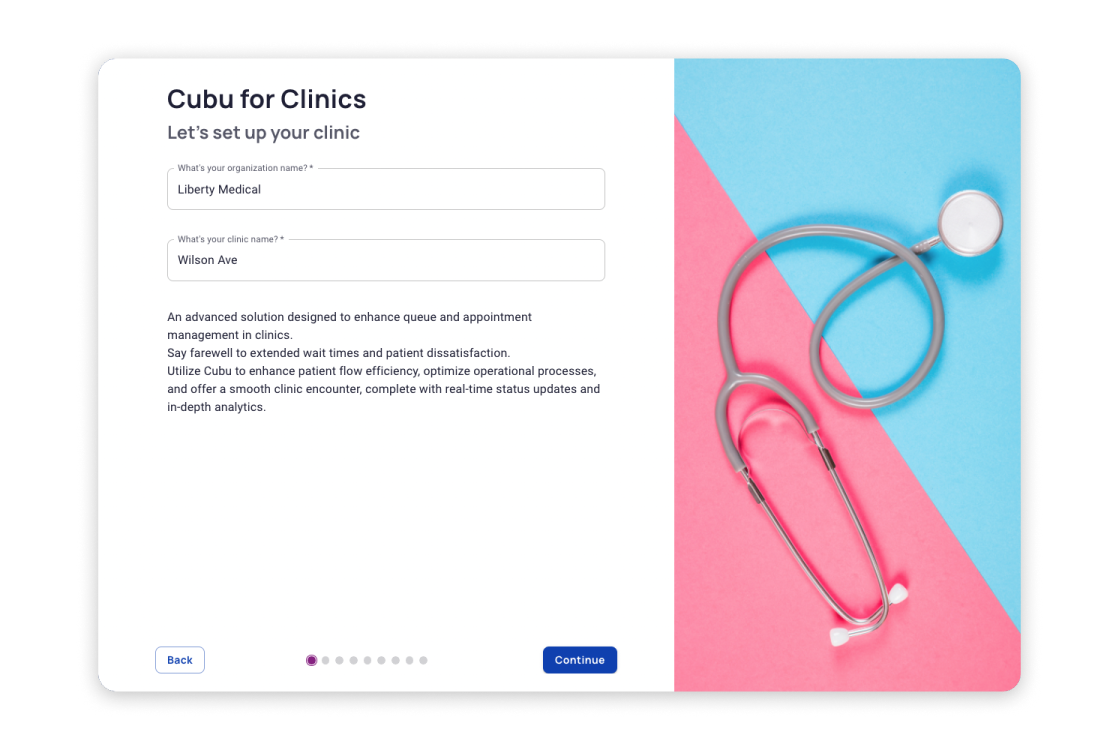
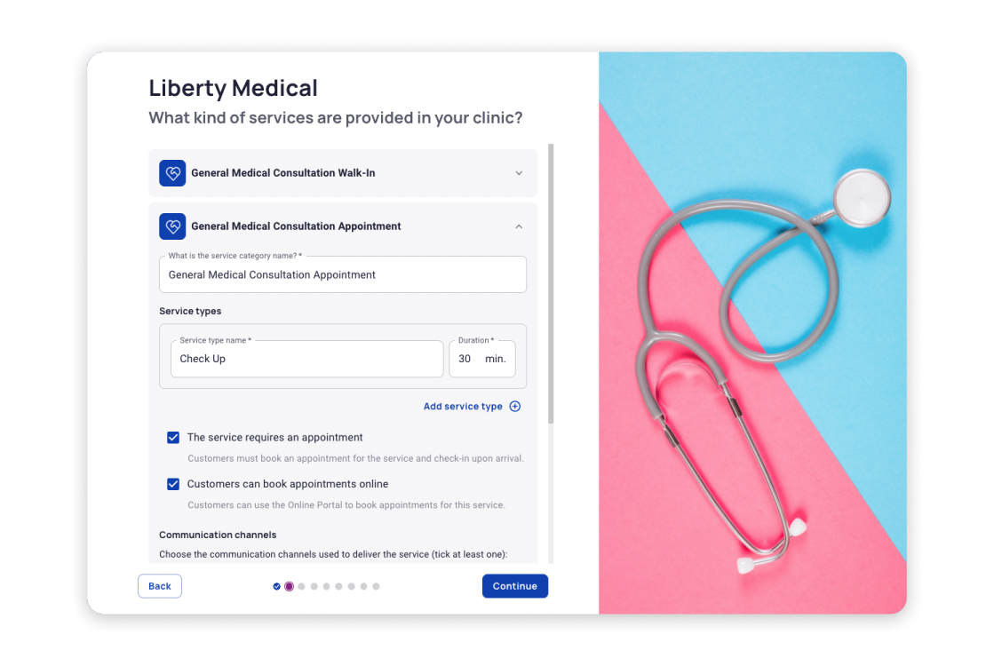
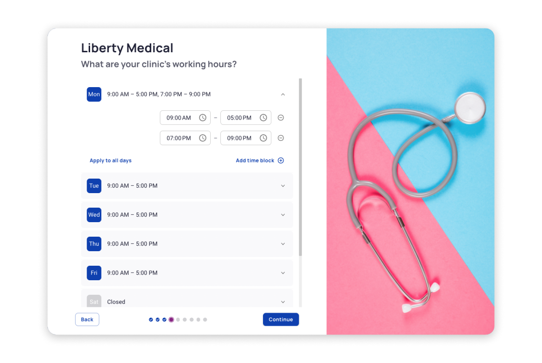
Onboarding
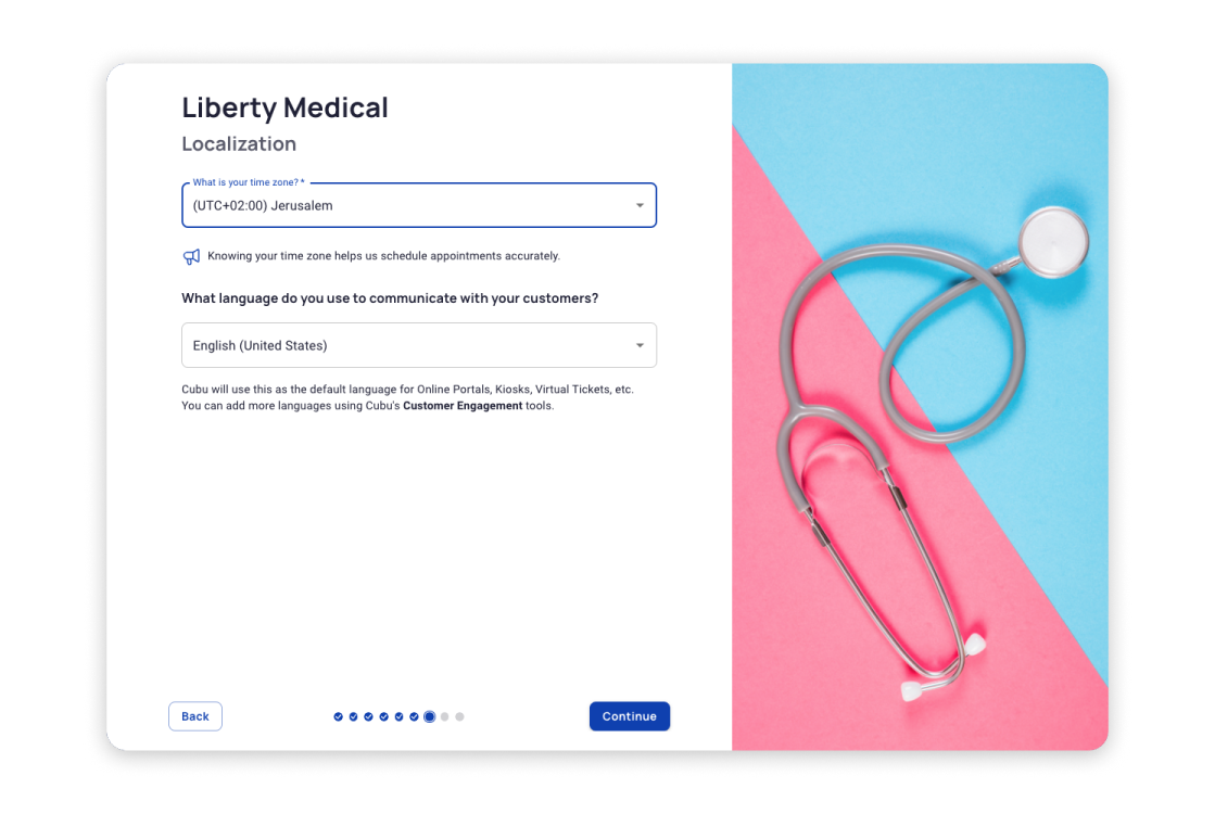
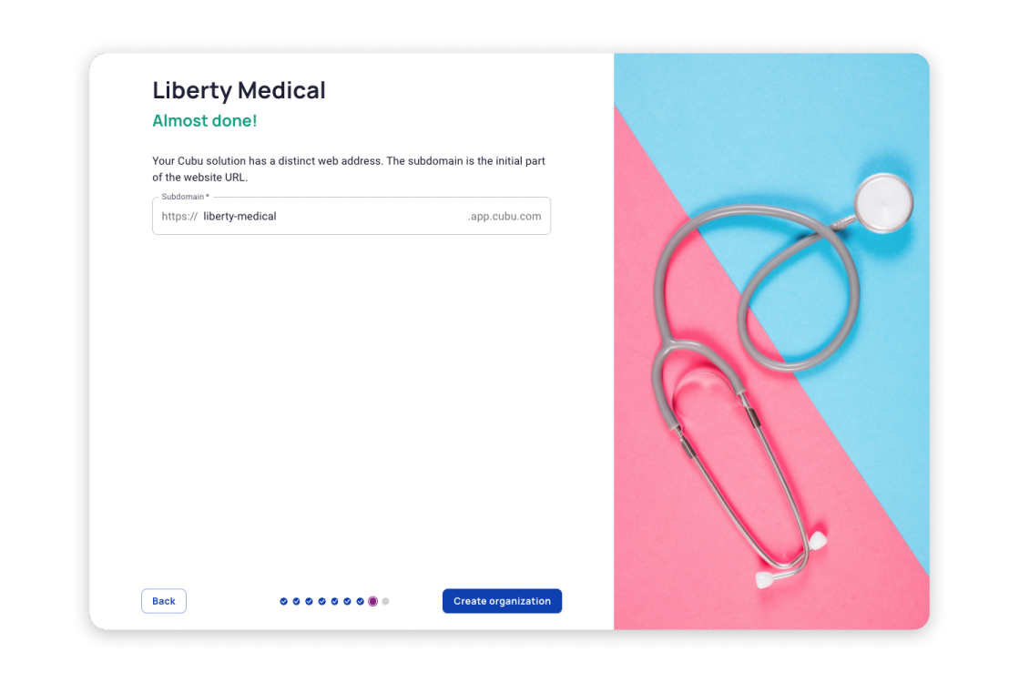
Onboarding is one of the latest and most crucial features of Cubu. It allows individuals, who are unfamiliar with the system’s internal logic, to quickly set up a fully functional trial system for their organization in just a few minutes, enabling them to start working without the complex process of traditional setup.


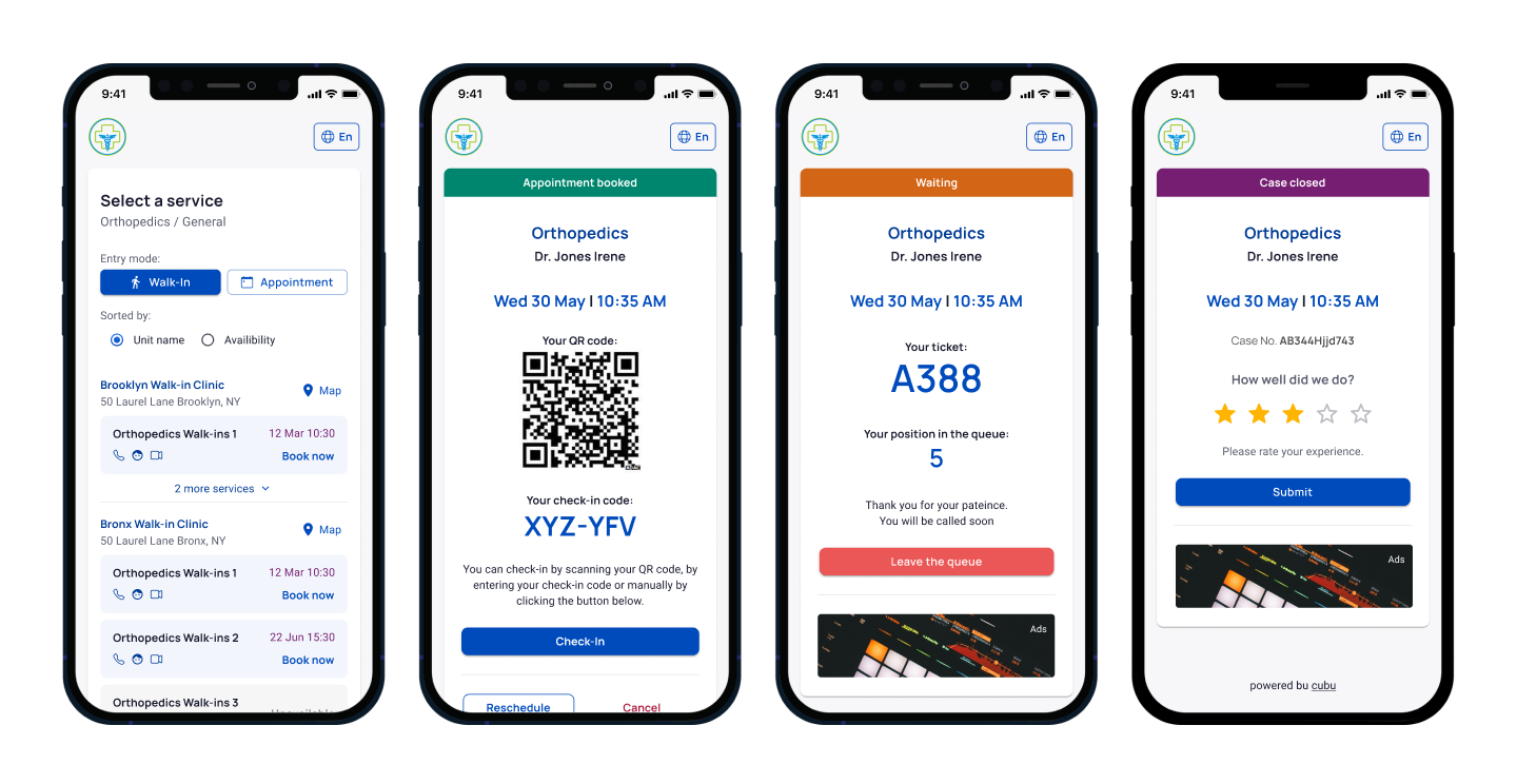
Mobile portal
The mobile portal guides the user through the entire journey, starting from finding a specialist and booking an appointment to the moment they enter the doctor’s office. And even beyond that — after the appointment, the user is prompted to rate the quality of the service.
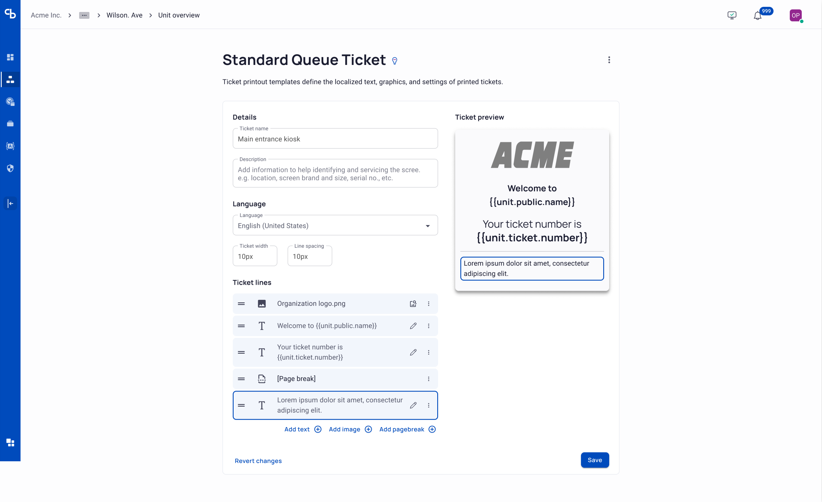
Paper Ticket Builder
The task of the paper ticket builder is to allow any organization to create their own customized ticket design without the need for a graphic designer. We solved this challenge by implementing an intuitive drag-and-drop interface, coupled with the ability for simultaneous previewing.
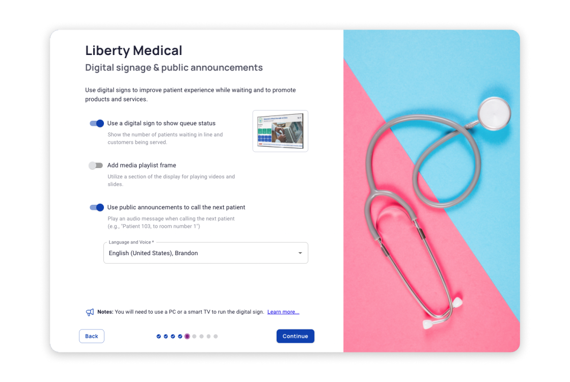
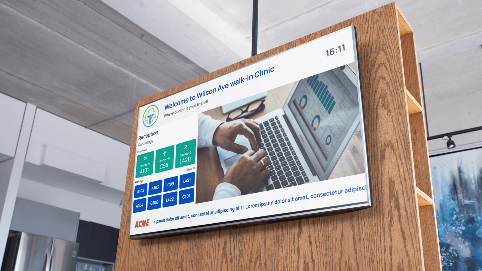
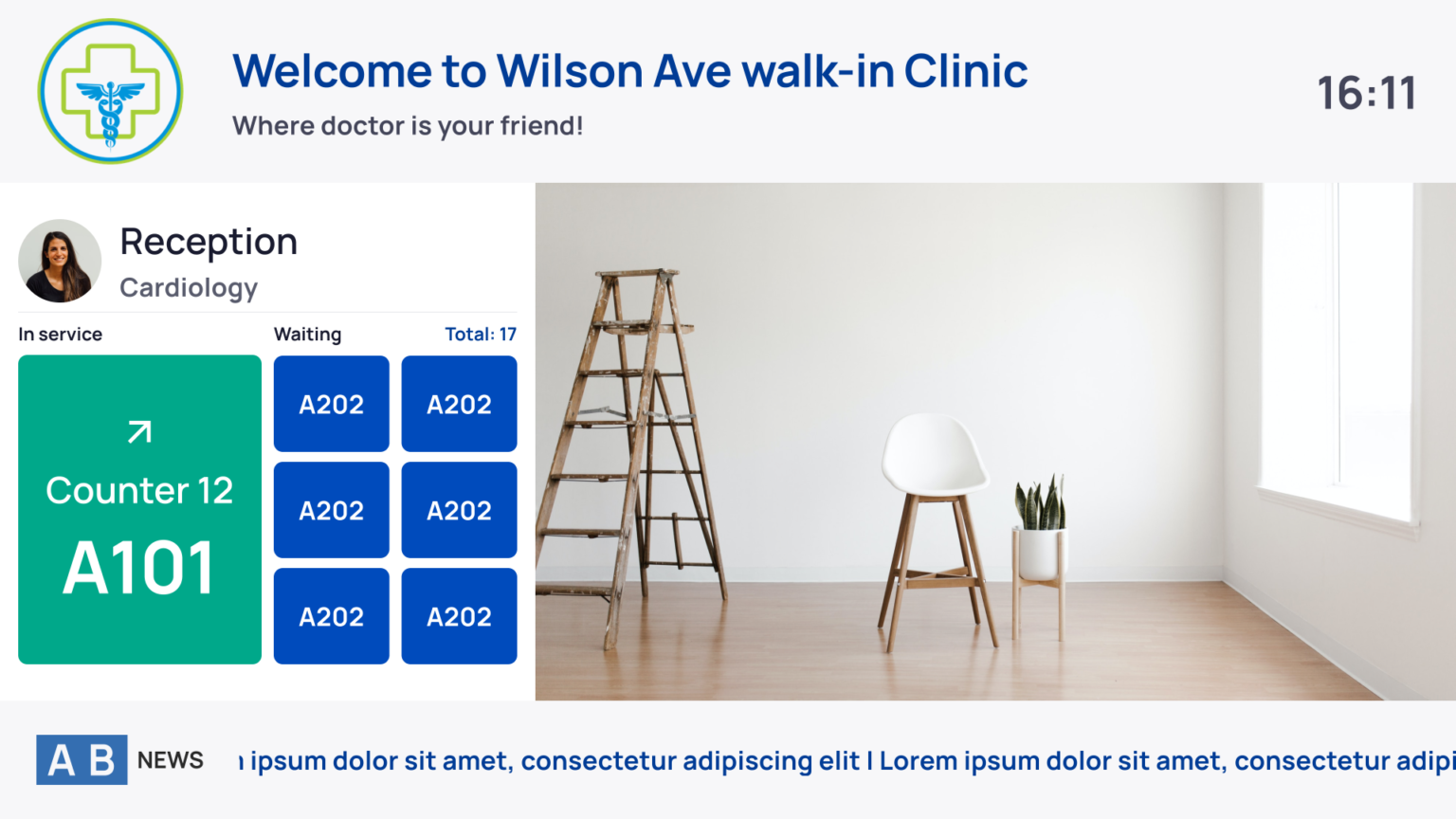
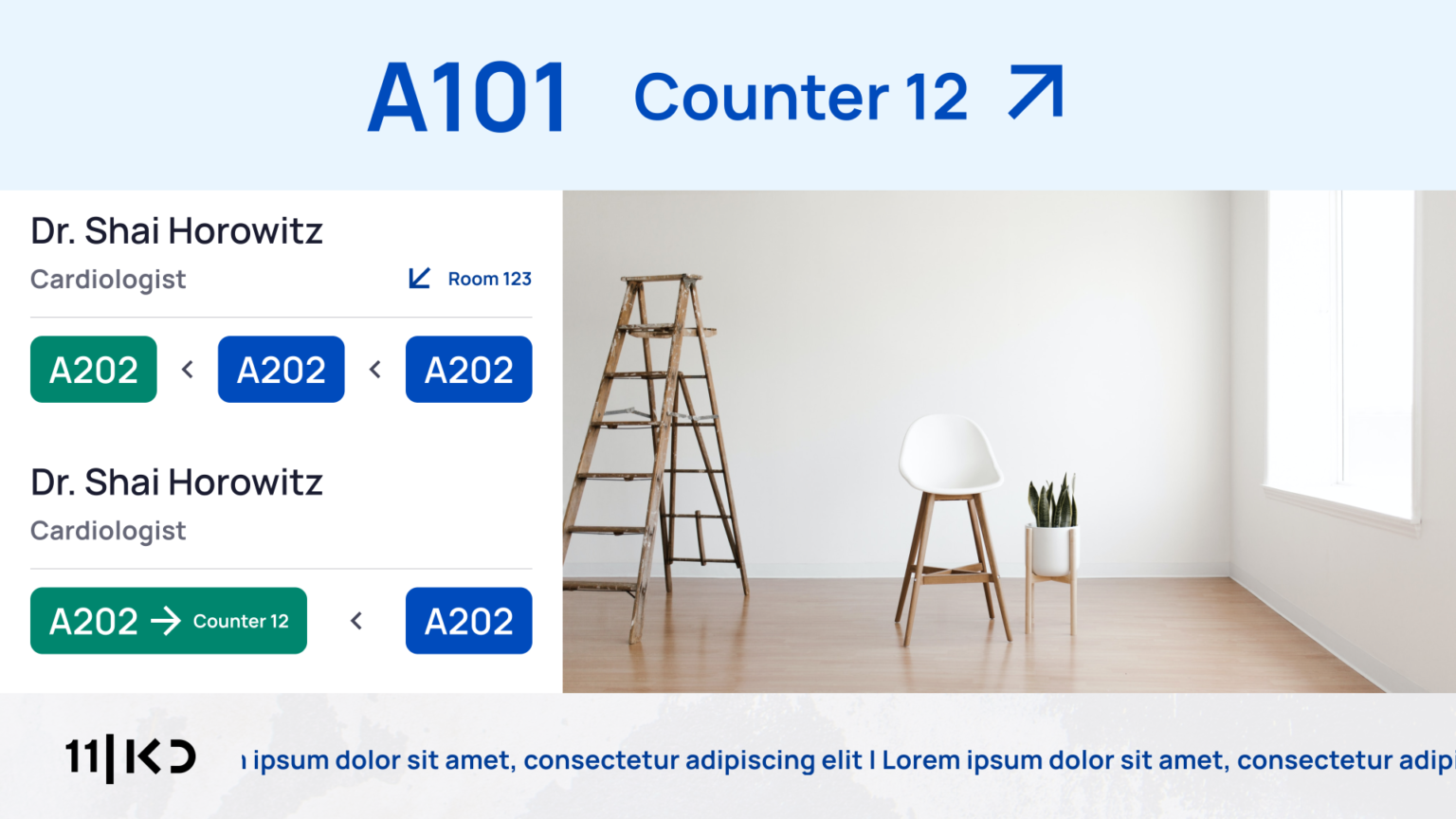
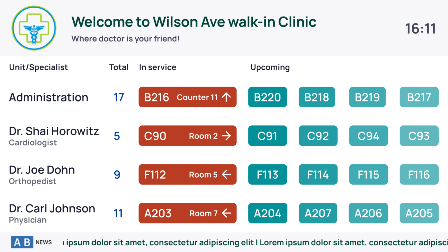
Digital Signage
Digital Signage is an essential component for any establishment that deals with clients in multiple streams. Each organization has its own set of individual requirements regarding the specific information that should be displayed on these screens. Therefore, our main task was to provide highly flexible layouts that could satisfy any request. Additionally, it was important to provide an option to customize the style, including changing color schemes and logos.
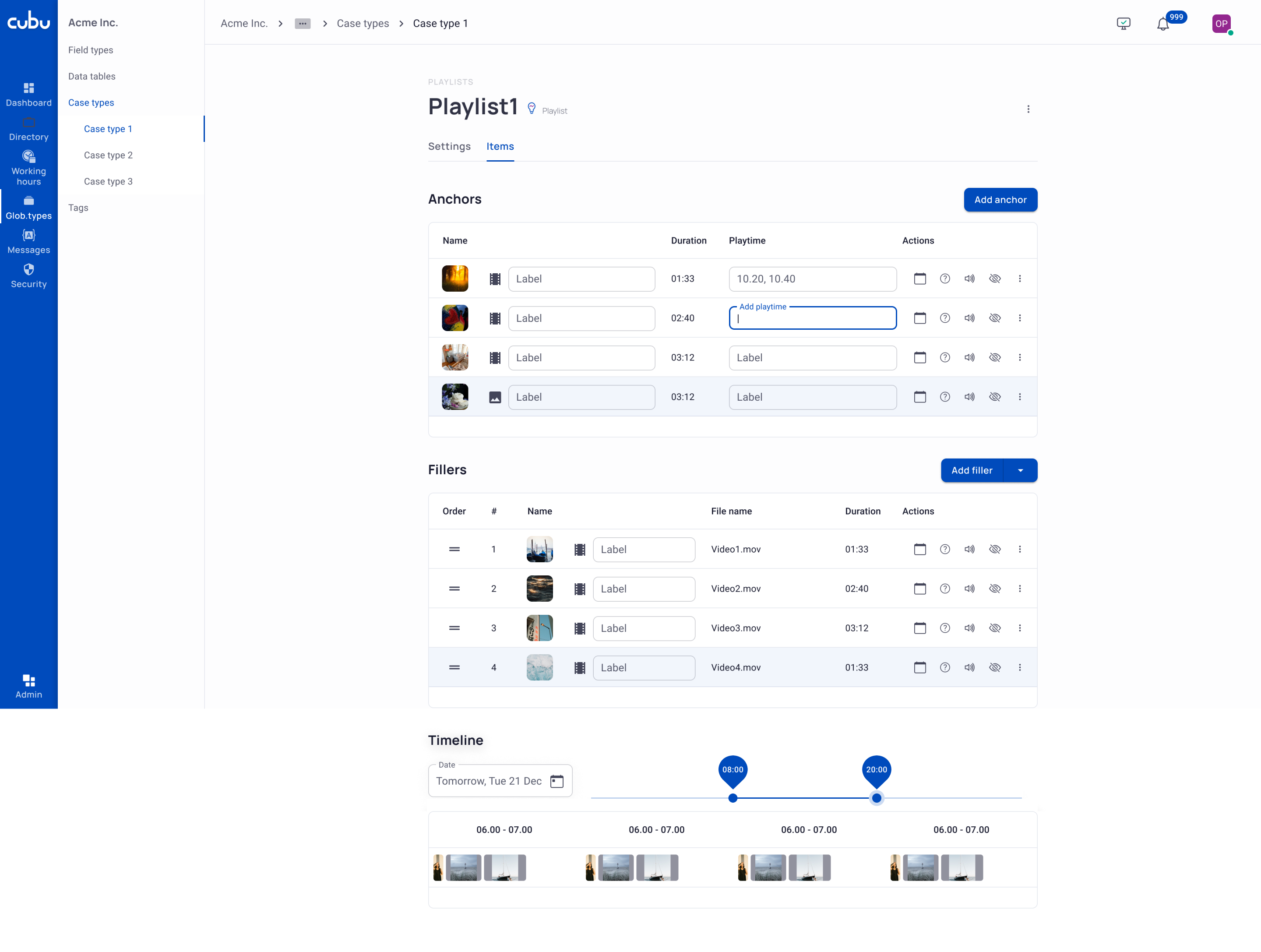
Digital Signage Playlist Editor
The Digital Signage Playlist Editor allows fine-tuning of showed media, such as setting up sequence, display duration, and frequency of repeats. Technically, the Playlist Editor allows creating unique playlists that take into account the audience statistics for a given hour or day of the week for the most effective targeting. This is also a very powerful tool for setting up paid advertising.
Summary
Working as a UX/UI designer on this B2B enterprise product, I faced the task of creating a user interface that was not only complex but also met the varying needs of each client. My goal involved integrating features across different devices (PCs, tablets, mobile phones, kiosks, TVs), making it challenging to maintain visual consistency and a unified interaction logic. Unlike standard consumer products where feedback is direct, here, my design process significantly relied on feedback from the Customer Relations team that worked closely with the Beta Clients and also from our great internal testing team, on hallway testings, and I also got many insights from conversations with my project’s programmers. This collaborative and feedback-focused approach was essential in developing a user-friendly interface that was adaptable to the complex requirements of our enterprise environment.
Vadim Pronin, 2024