Cinemap: map-first marketplace for film equipment
Years: 2021-2022
Position: Product Designer
Tasks: qualitative research, homepage IA, search & map flows, UX/UI design for B2B marketplace, managing components and states.
Tools used: Figma
Position: Product Designer
Tasks: qualitative research, homepage IA, search & map flows, UX/UI design for B2B marketplace, managing components and states.
Tools used: Figma
Context and goals
Cinemap is a marketplace for the film industry: renting and selling camera gear, hiring crew, booking locations, plus a professional community and events.
When I joined the project, the product was already live, but the homepage looked like a pure catalog showcase: a large hero banner, four tiles for the main directions (rent, sell, hire team, locations) and then carousels like “New in rentals…”, “New in sales…”, etc.
As the service grew, it became clear that this homepage no longer reflected the real complexity of the product:
Business goals for the homepage redesign:
UX goals:
When I joined the project, the product was already live, but the homepage looked like a pure catalog showcase: a large hero banner, four tiles for the main directions (rent, sell, hire team, locations) and then carousels like “New in rentals…”, “New in sales…”, etc.
As the service grew, it became clear that this homepage no longer reflected the real complexity of the product:
- the map with rentals was hidden in a separate section;
- there was no search on the first screen — users had to scroll and click around;
- the number of “streams” increased: besides rent/sell we now had services, content, events, and community.
Business goals for the homepage redesign:
- turn the first screen into an entry point into search and the map, not just a marketing banner;
- clearly surface the key product streams and prepare the platform for scaling (more cities, more types of offers);
- reduce the number of “lost” users who leave without understanding how Cinemap can help them.
UX goals:
- shorten the path to relevant offers (search, map, curated carousels);
- make the structure of the service and sections understandable at a glance;
- show that Cinemap is not just listings, but also a community, blog, and events.
Risks and constraints
Core risks:
For the business
For users
Constraints
For the business
- If we overload the first screen with a map, filters and content, users can simply “choke” on it and leave.
- Too aggressive flows (for example, a hard mandatory popup to choose a city or section) would increase bounce rate and break natural browsing.
For users
- It’s unclear where to start: rent? buy? services?
- It’s not obvious that the inventory is tied to a specific city and that this is a real rental map, not just a decorative background.
- On mobile the map easily turns into a “wall” that hides everything else.
Constraints
- Small team: no dedicated UX researcher — I handled research and iterations together with the founder.
- More qualitative than quantitative data: feedback mainly came from the marketplace owner and active users; analytics gave only a high-level picture of engagement.
- Evolution, not revolution: we couldn’t fully change the visual language — there was an existing design system and familiar patterns to respect.
Discovery: research and insights
Audit of the current homepage
I started by breaking down the existing homepage:
For a first-time visitor the homepage answered the question “what is this site in general”, but not “how do I find what I need right now”.
Feedback and behaviour
From the founder and from users via support, several patterns repeated:
User scenarios and jobs
Then I outlined the main entry scenarios:
Benchmarks
I looked at other services with strong geography and catalog components: rental marketplaces, booking services and maps. Key observations:
Key insights
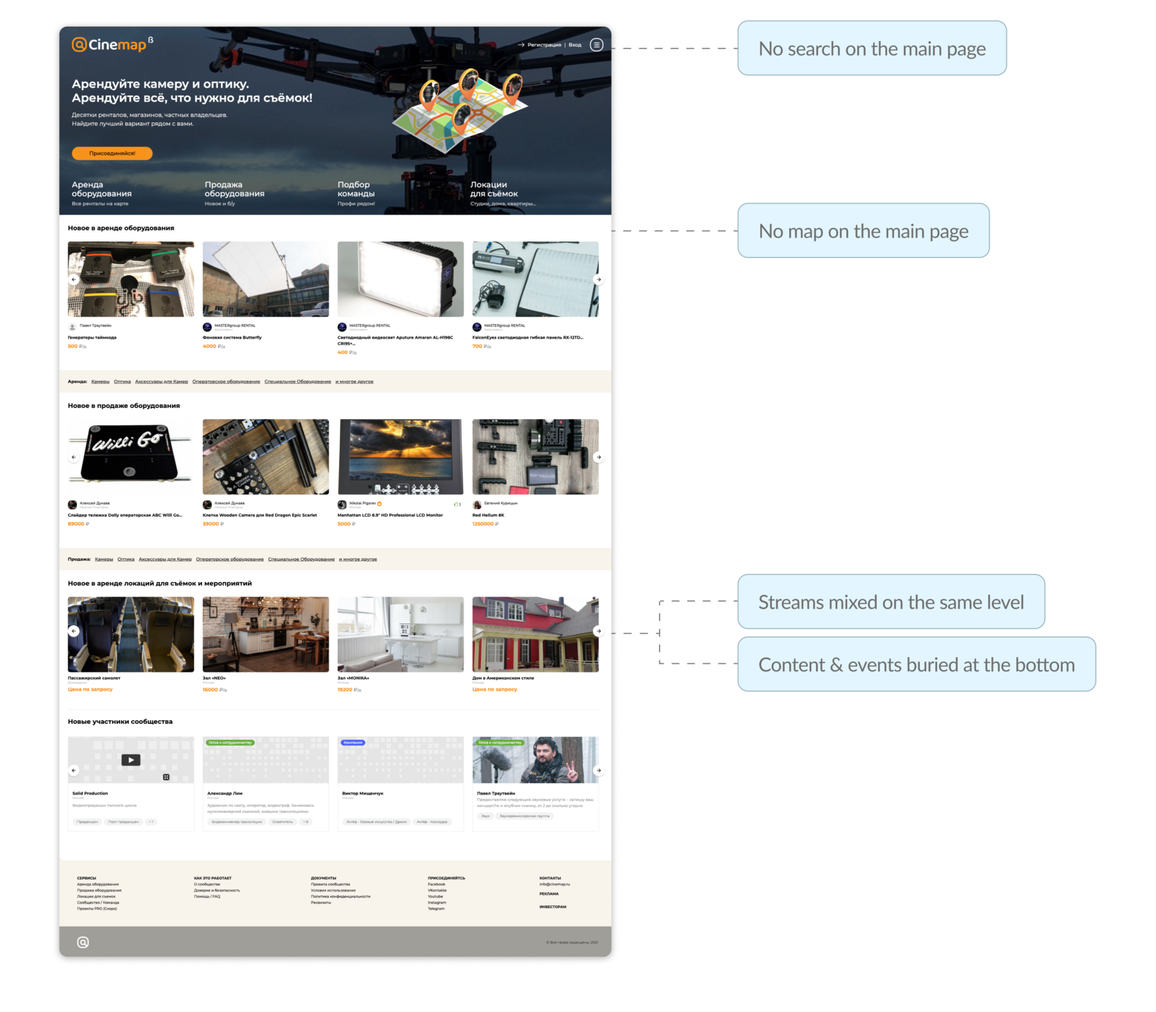
I started by breaking down the existing homepage:
- essentially it was hero + four direction tiles + “New in…” carousels;
- there was no map on the page at all — it lived only in the “Rent” section;
- the structure of streams was flat: rent and sales appeared on the same level as team hire and locations, even though their business weight is different;
- content and events were buried below, at the very end of the page.
For a first-time visitor the homepage answered the question “what is this site in general”, but not “how do I find what I need right now”.
Feedback and behaviour
From the founder and from users via support, several patterns repeated:
- people come with very concrete needs: “I need lights in my city for these dates”, not “I want to browse a pretty storefront”;
- many wanted to start with the map, to see what’s nearby;
- explaining to partners and new users “what Cinemap is” required long voice messages and presentations — the old homepage didn’t do the job.
User scenarios and jobs
Then I outlined the main entry scenarios:
- A DP/production team who knows what gear they need and where they’ll shoot — they want search and fast access to relevant filters.
- A person “trying the platform” — just wants to see what’s available in their city via the map and curated lists.
- An equipment owner or rental house who checks how their listings look in context.
Benchmarks
I looked at other services with strong geography and catalog components: rental marketplaces, booking services and maps. Key observations:
- successful products always provide a simple way into search and filters from the first screen;
- the map either lives on the homepage or is one click away and takes up most of the screen;
- streams (rent, sell, services, etc.) are clearly separated; secondary things go into an “More” area.
Key insights
- The homepage has to work as a search and navigation hub, not just a promo page.
- The map is not “a feature in the Rent section”, but the core visual metaphor of the service: “everything you need for shooting, on a map near you”.
- We need to show not only inventory but the whole ecosystem around film production — services, locations, community and events.
Ideation and experience structure
Based on this, the founder and I iterated through several structural options for the homepage.
Search as the first step
One of the key questions was what to do with search. In the old version it simply didn’t exist on the first screen.
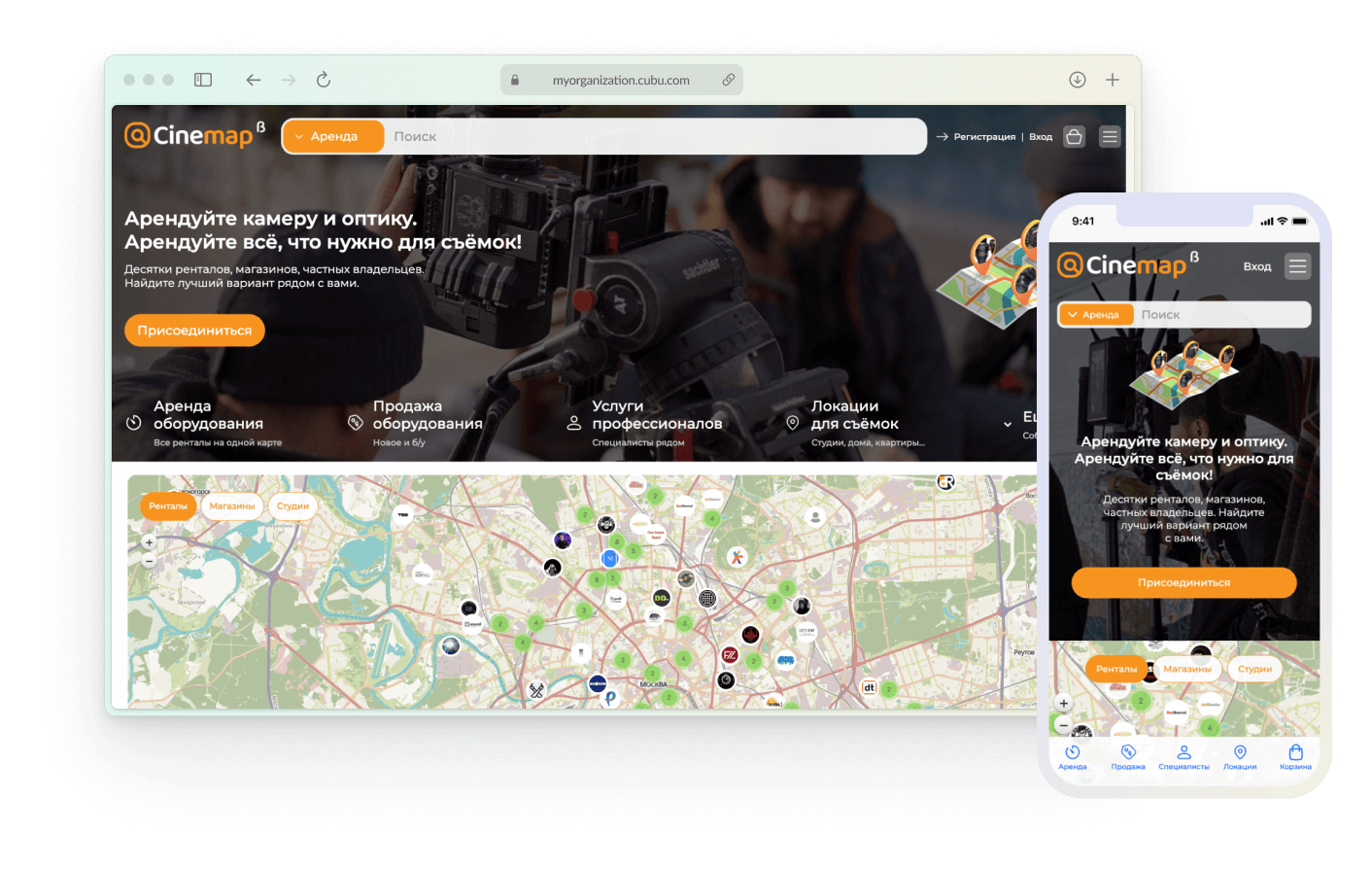
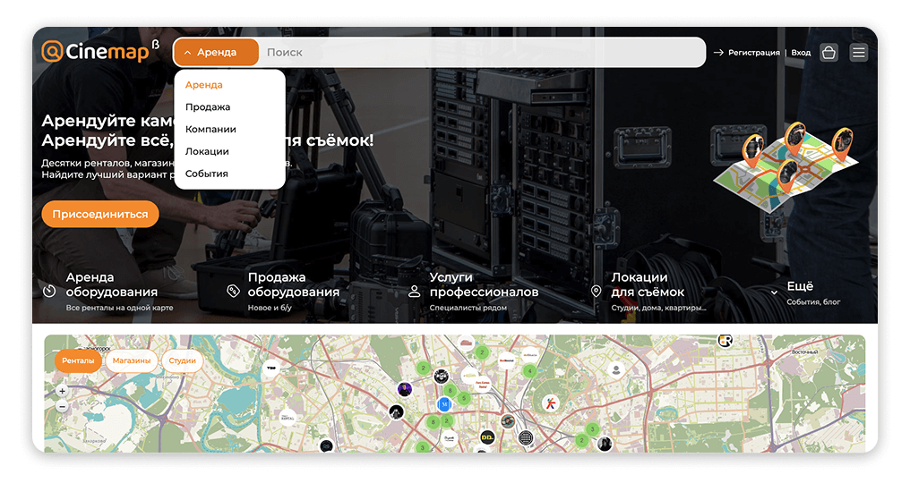
We decided to move it to the top as a wide search bar with a type selector: a dropdown on the left (“Rent / Sell / …”) and the input field on the right.
This immediately supports the “I know what I need” scenario: the user chooses the task type and types a specific piece of gear or query.
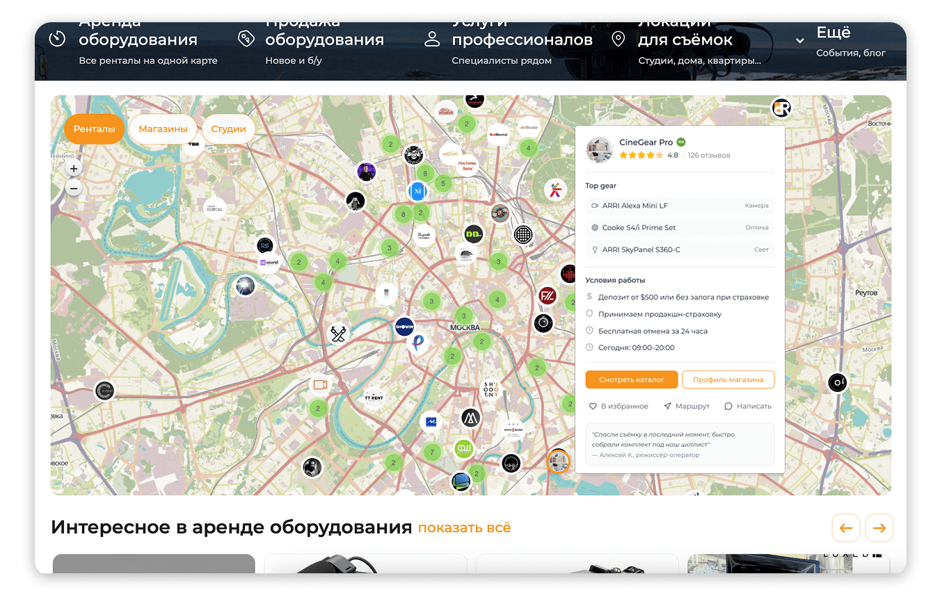
The map as the “second level” right on the homepage
The second big block is the map. We considered:
We chose the last one: the map appears right under the first screen, showing rentals, shops and studios. Above it sit simple filter chips (“Rentals”, “Shops”, “Studios”).
For the user this means:
Streams and navigation between sections
We also revisited the four direction tiles under the hero:
As a result we got a clear hierarchy:
Cards and content below the map
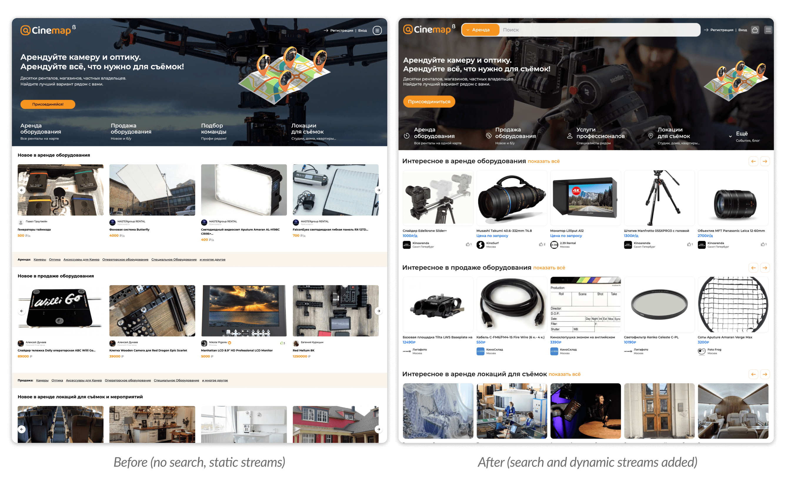
Below the map we replaced “New in rentals/sales…” with “Interesting in…”. That’s a shift from pure chronology to curation: we can surface not only latest additions, but more useful selections (by popularity, quality, promotions).
Even further down we added “New community members”, “Blog” and “Events” blocks — now the homepage talks not only about objects but also about people and knowledge around them.
Search as the first step
One of the key questions was what to do with search. In the old version it simply didn’t exist on the first screen.
We decided to move it to the top as a wide search bar with a type selector: a dropdown on the left (“Rent / Sell / …”) and the input field on the right.
This immediately supports the “I know what I need” scenario: the user chooses the task type and types a specific piece of gear or query.
The map as the “second level” right on the homepage
The second big block is the map. We considered:
- map only inside the Rent section;
- a compact map preview on the homepage;
- a full-width map taking a significant part of the screen.
We chose the last one: the map appears right under the first screen, showing rentals, shops and studios. Above it sit simple filter chips (“Rentals”, “Shops”, “Studios”).
For the user this means:
- they immediately see that Cinemap covers real cities, not an abstract list of items;
- they understand the density of offers and geography.
Streams and navigation between sections
We also revisited the four direction tiles under the hero:
- we kept “Rent equipment” and “Sell equipment” as the two key axes;
- “Hire a crew” evolved into a broader “Professional services”;
- “Locations for shooting” remained a separate stream;
- everything that isn’t a core scenario moved into an “More” item (events, blog, etc.).
As a result we got a clear hierarchy:
- primary work scenarios (rent/sell);
- services around them (pros, locations);
- the “tail” of extras in “More”.
Cards and content below the map
Below the map we replaced “New in rentals/sales…” with “Interesting in…”. That’s a shift from pure chronology to curation: we can surface not only latest additions, but more useful selections (by popularity, quality, promotions).
Even further down we added “New community members”, “Blog” and “Events” blocks — now the homepage talks not only about objects but also about people and knowledge around them.
Design and implementation
Visual language and hierarchy
I kept the overall Cinemap visual style (colors, typography, card patterns) but rebuilt the hierarchy:
Key states and components
I introduced or updated several components:
All of these were added to the design system so we could reuse them later across search, catalog and internal pages.
I kept the overall Cinemap visual style (colors, typography, card patterns) but rebuilt the hierarchy:
- the search bar in the header became the main accent: a wide input, a contrasting button and a prominent type selector;
- the directions block under the hero is aligned to the grid: icons plus short labels and sub-copy clarifying the value;
- the map spans almost the full width and is visually separated from both the streams block and the carousels below.
Key states and components
I introduced or updated several components:
- “search type selector” (dropdown to the left of the input);
- “map filter chip” component (“Rentals”, “Shops”, “Studios”);
- refreshed object cards in the “Interesting in…” carousels;
- blog and event cards with date, format and imagery.
All of these were added to the design system so we could reuse them later across search, catalog and internal pages.
Responsive behavior
On desktop, the map is fully visible and the carousels sit below. On mobile, it’s important not to overload the user, so:
Handoff and support
For the dev team I prepared:
During implementation I helped review the builds:
On desktop, the map is fully visible and the carousels sit below. On mobile, it’s important not to overload the user, so:
- the map appears after a short block with the main streams;
- filters and map controls are simplified; the map can take up a separate screen on scroll.
Handoff and support
For the dev team I prepared:
- a flow diagram of entering the homepage for different scenarios;
- a set of states (empty, loading, error);
- an interaction spec (hover/tap on pins, switching chips, scrolling to carousels).
During implementation I helped review the builds:
- checked key paddings and component sizes;
- negotiated compromises when technical constraints didn’t allow us to implement the “ideal” version (for example, certain map animations).
Results and learnings
1. What changed after launch
After releasing the new homepage we compared 30-day windows in Yandex.Metrica (before vs. after, adjusting for seasonality). We didn't run a controlled A/B test, so the numbers below are directional — but the trends were consistent and clear.
Engagement with search and map The most visible shift: interactions with the search bar on the first screen roughly doubled, and map engagement (clicks on pins, zoom, panning) grew from a niche behavior to one of the primary entry patterns. The map was no longer a hidden feature — it became the thing people reached for first.
Bounce rate Dropped by several percentage points. Not a dramatic cliff, but a steady improvement — fewer people were closing the page without any interaction. The homepage started answering the question "what can I do here?" faster.
Depth of exploration Users who landed on the new homepage reached concrete listing cards noticeably faster: the average number of cards viewed in the first few minutes of a session went up. The combination of search, map and curated "Interesting in…" blocks gave people multiple paths into the catalog instead of one.
Downstream conversions The share of homepage sessions that ended with a target action (booking request or contact request) showed moderate growth — not a leap, but a meaningful improvement given that we changed only the entry point, not the booking flow itself.
2. Qualitative changes
Beyond the numbers, several things shifted:
In future iterations, I'd like to run a proper A/B experiment on different variants of the first screen — varying the balance between search, map and curated lists — and compare them not only by engagement, but by conversion into bookings and traffic quality for rental partners.
After releasing the new homepage we compared 30-day windows in Yandex.Metrica (before vs. after, adjusting for seasonality). We didn't run a controlled A/B test, so the numbers below are directional — but the trends were consistent and clear.
Engagement with search and map The most visible shift: interactions with the search bar on the first screen roughly doubled, and map engagement (clicks on pins, zoom, panning) grew from a niche behavior to one of the primary entry patterns. The map was no longer a hidden feature — it became the thing people reached for first.
Bounce rate Dropped by several percentage points. Not a dramatic cliff, but a steady improvement — fewer people were closing the page without any interaction. The homepage started answering the question "what can I do here?" faster.
Depth of exploration Users who landed on the new homepage reached concrete listing cards noticeably faster: the average number of cards viewed in the first few minutes of a session went up. The combination of search, map and curated "Interesting in…" blocks gave people multiple paths into the catalog instead of one.
Downstream conversions The share of homepage sessions that ended with a target action (booking request or contact request) showed moderate growth — not a leap, but a meaningful improvement given that we changed only the entry point, not the booking flow itself.
2. Qualitative changes
Beyond the numbers, several things shifted:
- it became much easier for the founder to explain the product — sending the homepage link was now enough, no voice messages or decks needed;
- support saw fewer "what does this site even do?" and "where is the map?" questions;
- new users more often discovered listings through curated blocks rather than only through direct search.
In future iterations, I'd like to run a proper A/B experiment on different variants of the first screen — varying the balance between search, map and curated lists — and compare them not only by engagement, but by conversion into bookings and traffic quality for rental partners.