Mapinamo: From Vibe-Coded MVP to Production-Ready UX
Year: 2026
Position: Product Designer
Tasks: UX & product audit, onboarding flow redesign, map interaction & filter UX, information architecture for saved searches and hex bookmarks, product strategy
Tools used: Figma
Position: Product Designer
Tasks: UX & product audit, onboarding flow redesign, map interaction & filter UX, information architecture for saved searches and hex bookmarks, product strategy
Tools used: Figma
Context
Mapinamo helps entrepreneurs choose locations for new businesses. The user defines a few parameters — business type, factors that matter to them, competitors — and the system processes several dozen metrics from multiple sources, rendering the result on a map divided into hexagons.
The product had been built to a near-MVP state by two co-founders — data scientists who vibe-coded the interface without design support. They brought me in for a UX review and a prioritized set of recommendations.
How I approached the audit
Vibe-coded MVPs almost always mix three different layers of problems. Separating them upfront makes prioritization possible:
Cosmetic layer — inconsistent buttons, spacing, typography.
UX layer — friction in flows, cognitive overload, navigation.
Product layer — decisions that affect whether the user reaches the product's value at all.
UX layer — friction in flows, cognitive overload, navigation.
Product layer — decisions that affect whether the user reaches the product's value at all.
I logged the cosmetic issues but deliberately pushed them down the list. The most serious problems in Mapinamo lived at the product layer — and that's where the audit needed to start.
#1. The strategic problem: long onboarding with no payoff
The most serious finding wasn't a UX issue in the strict sense.
After completing a multi-step onboarding that already taxes the user cognitively, the map opens with no result. A panel of settings appears, and the implicit expectation is that the user will start playing with filters and eventually arrive somewhere.
From a product standpoint, this is risky. The user came for a specific answer — where should I open my business — and their effort budget is limited. If after serious work in onboarding they still see no suggested locations, motivation drops, and a meaningful portion of users will churn before reaching value the product is actually capable of delivering.
Recommendation: add a dedicated Top Spots tab in the right sidebar that opens immediately after onboarding — five highest-ranked hexagons under default metric weights, each explorable. Subsequent filter work refines an existing result instead of building one from scratch.
This gives users an Aha moment within seconds of finishing onboarding — which is the entire reason they sat through the survey in the first place.
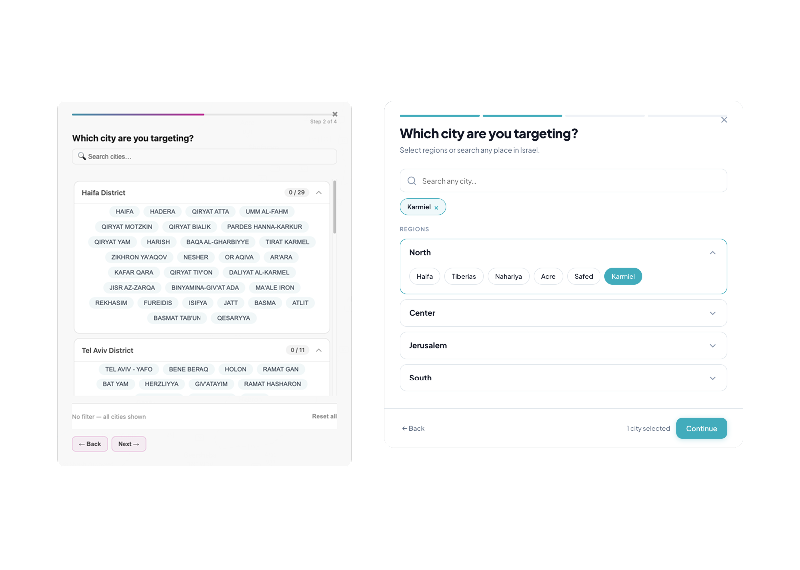
#2. Onboarding: reduce cognitive load
Each onboarding step asked users to compare dozens of options presented as flat text.
- Business type. Break the flat chip list into thematic groups (food & beverage, retail, services, etc.) and add type-ahead search.
- City selection. Cities were nested inside region accordions without any order, and selections made in one accordion became invisible when the user switched to another. I proposed a persistent indicator above the accordions showing what was already selected, plus type-ahead search.
- "What matters for your business?" Instead of a chaotic chip cloud (tourist zone, parking, park, supermarket — all mixed together), presets keyed to business type. For a café, options like Office-district lunch spot, Residential weekend café, Tourist-zone café. Manual configuration stays available for users who want it, but no one is forced to start from a blank slate.
- Competitors. Smart defaults derived from business type (for cafés — other cafés, fast food, pizzerias), with override available.
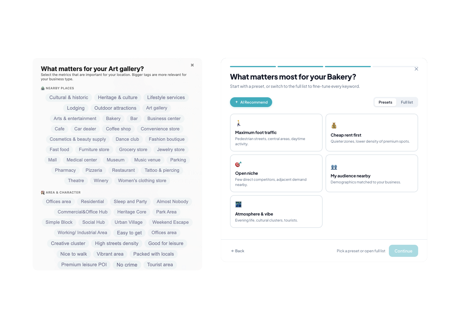
The underlying principle: someone opening their first café doesn't know what matters for their business. Forcing them to figure it out from zero offloads work the product can do for them. Presets and smart defaults are a form of product accountability to the user, not a shortcut.
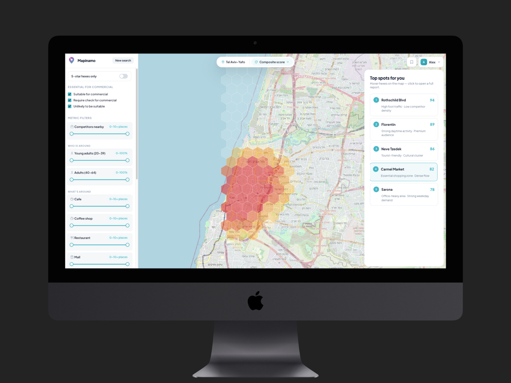
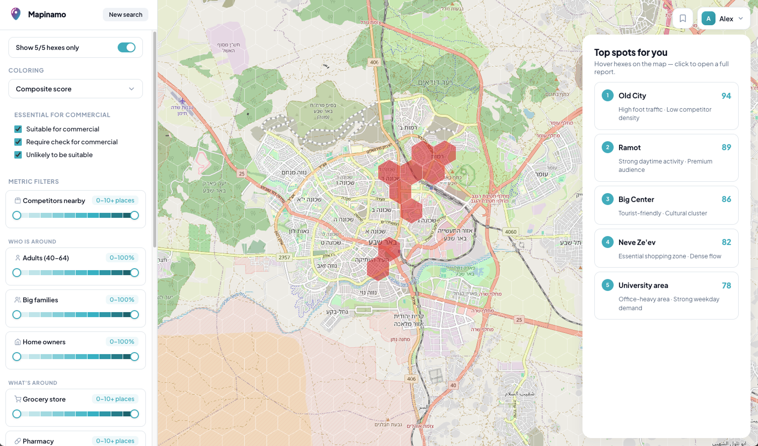
#3. The map: a technical interface where a product interface should be
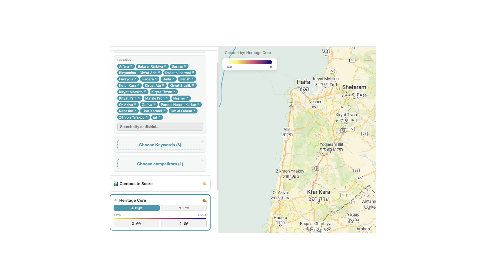
Main map interface fragment before redesign: clear to a data analyst, difficult for an unprepared user
The map UI was built the way a data scientist would naturally build it: a left panel of metrics, each with its own range slider. Self-evident to the people who built it; opaque to a first-time user.
- Rework the filter UI around user intent rather than technical levers.
- AI orientation assistant — a short guided tour that sequentially highlights key map elements, callable again at any point.
- Move full hex stats out of the modal popover and into the right side panel (a tab next to Top Spots). In the original, comparing two adjacent hexagons required opening and closing the popover repeatedly, breaking flow. With the panel, the user stays on the map, clicks neighboring hexes, and compares. The final AI-generated report is a separate, deliberate action.
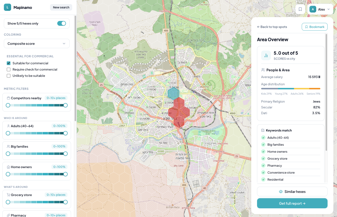
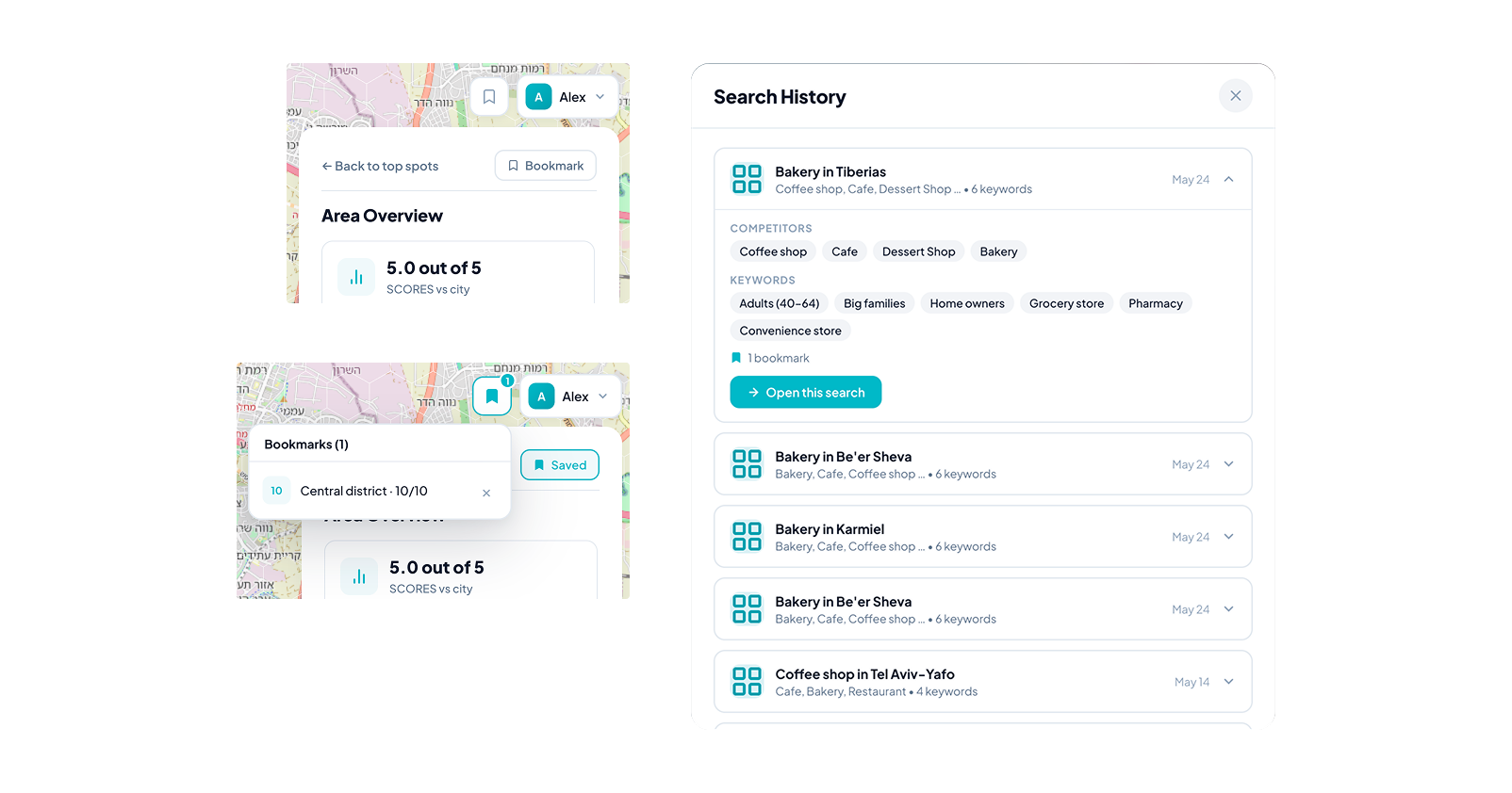
#4. Saving architecture: hex bookmarks and search history
A non-trivial IA question: what exactly is the user saving — the onboarding configuration (business type + metrics + competitors), individual hexagons, or the state of filters at the moment of the click?
The logic I proposed:
The logic I proposed:
- Search history stores onboarding configurations.
- Hex bookmarks are hierarchically nested under a specific search configuration.
- A bookmark captures the filter state at save time, because the same hexagon can have different value depending on which filters are active.
- Returning to a past search restores the filter state the user left it in, rather than resetting to default. This removes the burden of mentally reconstructing context.
The architecture preserves context where context matters, without making the user think about it.
Out of scope
Cosmetics — UI inconsistencies, typography, spacing. Logged in a separate document. At the product's current stage, fixing these has limited impact on key metrics compared with the product-layer changes; they're worth revisiting once the foundational recommendations are in.
Conclusion
Vibe-coded MVPs are an increasingly common artifact. They share a signature: technically functional products whose interface reflects the builders' mental model rather than the user's. Auditing them isn't cosmetic work — it's the transition from tool that works to product that lands.
For Mapinamo, I mapped the problems across three layers, prioritized by product impact, and packaged the recommendations so the team can ship them incrementally, starting with the highest-leverage changes.
For Mapinamo, I mapped the problems across three layers, prioritized by product impact, and packaged the recommendations so the team can ship them incrementally, starting with the highest-leverage changes.